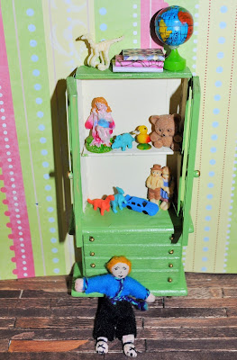
I finished painting my hutch. I went with a sage green, suggested by Deborah. Then, I of course, had to play with some ideas to see how versatile it could be. In the first picture, its a kitchen hutch.
The above decor is my favorite so far.
Then a hutch for a children's room.
And for the last two pictures, I find it interesting how lighting can change the feel of a picture.


I like them all! I especially like the one for the children's room. You have so many fun toys inside and on top. Isn't it amazing the difference light makes? It changes the color of the cabinet and the mood of the picture.
ReplyDeleteThank you so much!
DeleteI Really like your painted hutch Brandy and I like the way you've been able to maximize its versatility by changing the mini displays behind the doors.
ReplyDeleteHave you considered making removable paper panel inserts so that you can change uo the backdrops behind each of your shelf displays?
That's a cool idea worth trying. Thank you!
DeleteYour choice of color really complements each of the themes so nicely! I love the way it brought out the details, too!
ReplyDeleteThank you!
Delete¡Hay que ver lo diferentes que son las escenas con el cambio de pared!
ReplyDeleteThank you!
DeleteVery interesting post! ✔️✔️✔️ I hope you have a great weekend! 🌺🌺🌺
ReplyDeleteEs un verde muy bonito y con la iluminación queda genial !!!
ReplyDeleteAgain, amazing. Seriously.
ReplyDeleteThank you!
Delete